- A logo can be composed of a logotype, a logomark or both.
- Logo design doesn't only refer to the name of the business; it can be a symbol used to represent the business.
Anyone who’s ever decided to undertake a branding project has likely been asked whether he or she is looking for a logomark or logotype. The majority of logos consist of letters — that is the logotype design — and a symbol or icon called a logomark.
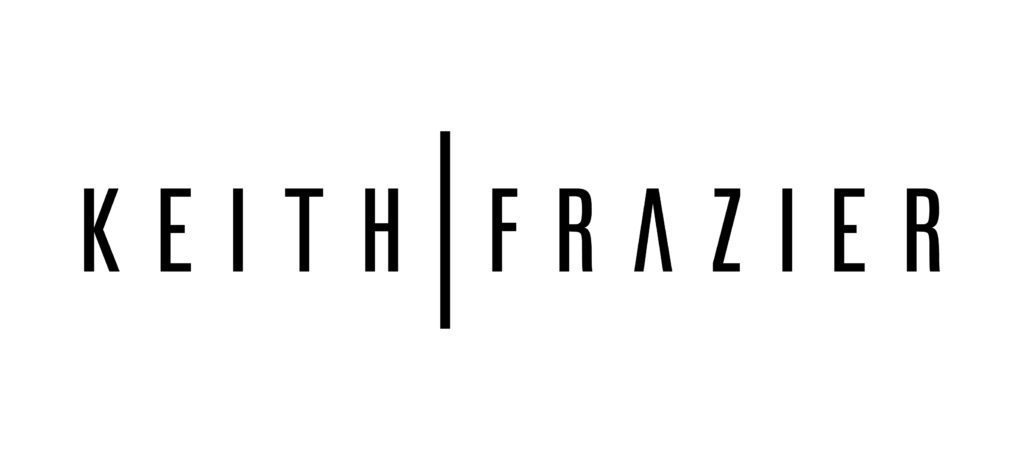
A logotype is essentially the name of a business that is designed using unique typography to set it apart. A logomark is an identifying mark that does not contain the company name but stands for it.
Logotype:

Logomark:

Logotype + Logomark:

When people talk about logo design, they are usually referring to the business name, not the mark, though the distinction is important.
A logomark is not always needed when the logotype is done correctly. A logo can be very strong using only typography to create the logo, resulting in a recognizable and powerful brand.
Nevertheless, a good logotype won’t be a simple font; it will have some element that prevents someone from just typing the logo.
Logotypes can are modified by using one or all of the following techniques:
Stroke: A stroke is the central diagonal portion of a letterform and is secondary to the main stems. It can be modified to be a regular serif, bracketed serif, or half-serif. Any letters that don’t end in a serif can have curved ends, swash, a teardrop, ball, beak or can be hooked.

Kerning: In typography, kerning is the process of adjusting the spacing between characters to achieve a more pleasing aesthetic result. In kerning, you adjust the space between individual letter forms uniformly over several letters.

Leading: In typography, leading refers to the distance between the baselines of successive lines of type. This changes the vertical distance between the letters.

Ligatures: In writing and typography, a ligature occurs where two or more letters are joined. Extending ligatures creates a modification of the font, which gives it a unique look.

There are some instances in which you should only use a logotype. Agents who work for larger brokerage firms are sometimes required to use their logomark and logotype, so stick to just a logotype. To avoid confusion, don’t use too many symbols.
Consistency is always key, regardless of whether you opt to use a logotype or a logomark.
Examples of good logotype: Crate and Barrel, Samsung, FedEx, Cartier, Google and Microsoft.
A logo does not always need a logomark; a logotype can work perfectly well to accomplish a company’s goals.
Laura Ure is the CEO of Keenability, a marketing agency specializing in lifestyle marketing that targets the affluent buyer. Follow her on Facebook or Twitter.


