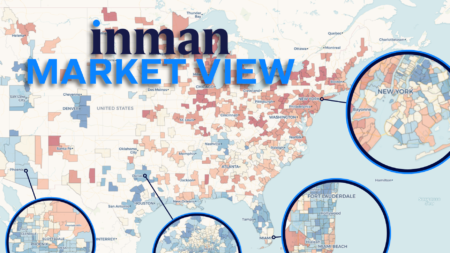
Compare you market to hundreds of others with Inman Market View's interactive maps and charts

New data shows that the best neighborhoods for families are getting harder to afford
Compare your market to hundreds of others with Inman's interactive maps and charts
Compare your market to hundreds of others with Inman's interactive maps and charts
It's not just the biggest inventory gainers that have seen their stream of for-sale homes slow. Some of America's most listing-starved metros are once again losing ground. Dive deeper with Inman Market View's interactive maps and charts
Real estate's Great Rebalancing has entered a new chapter — one in which this summer's biggest inventory engines have become a drag on active-listing growth in the fall

More than half of US homes have dropped from their peak value, according to Zillow. However, the statistic isn't dire as it seems, with the majority of homes holding their value between sales
Markets that had been bright spots amid troubled times are now seeing new listings slow. Dive into the local data with Inman's recurring series of interactive maps and charts