
In June we launched Inman Market View, a new initiative to put more data on local markets directly into the hands of Inman readers.
Today, Inman Market View takes a significant step forward with the rollout of two even more powerful and versatile tools for subscribers. Both tools rely on data published monthly by Realtor.com, with additional analysis and contextual framing provided by Inman’s data team.
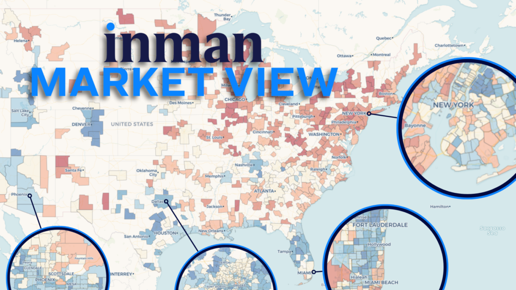
The first of these tools is the Inman Market Explorer, an extraordinarily detailed map of the U.S. housing market.
This tool is fully interactive. Users can zoom into a region, drag the frame to move around, and toggle between the various metric and time-period options from the dropdown boxes.
For the first time in an Inman tool, this map also allows readers to drill down even deeper within any of the nearly 500 displayed markets — all the way to the ZIP code level. To do this, select a market from the first dropdown box, or simply click on that market from the national map.
Inman also wanted readers to be able to access a more complete picture of a market’s path through the ups and downs of the post-pandemic housing environment. For this purpose, we’re rolling out a second tool: Inman Market Trends, a collection of comparative data charts tracking each market’s path over time.
The tool below is similarly interactive. It comes pre-loaded with national data, but can be used to select up to four metro markets to compare their trajectories against each other. It has the same options for metrics and time periods as well.
The new Inman Market View tools are designed for anything from a quick look-up to a more in-depth exploration, depending on how you prefer to use them. We hope you find these tools informative and engaging. Inman will update them at the beginning of each month as new data comes in.